Wrapped in Waves: The Story of the azulomo Logo

by azulomo | 3 min read
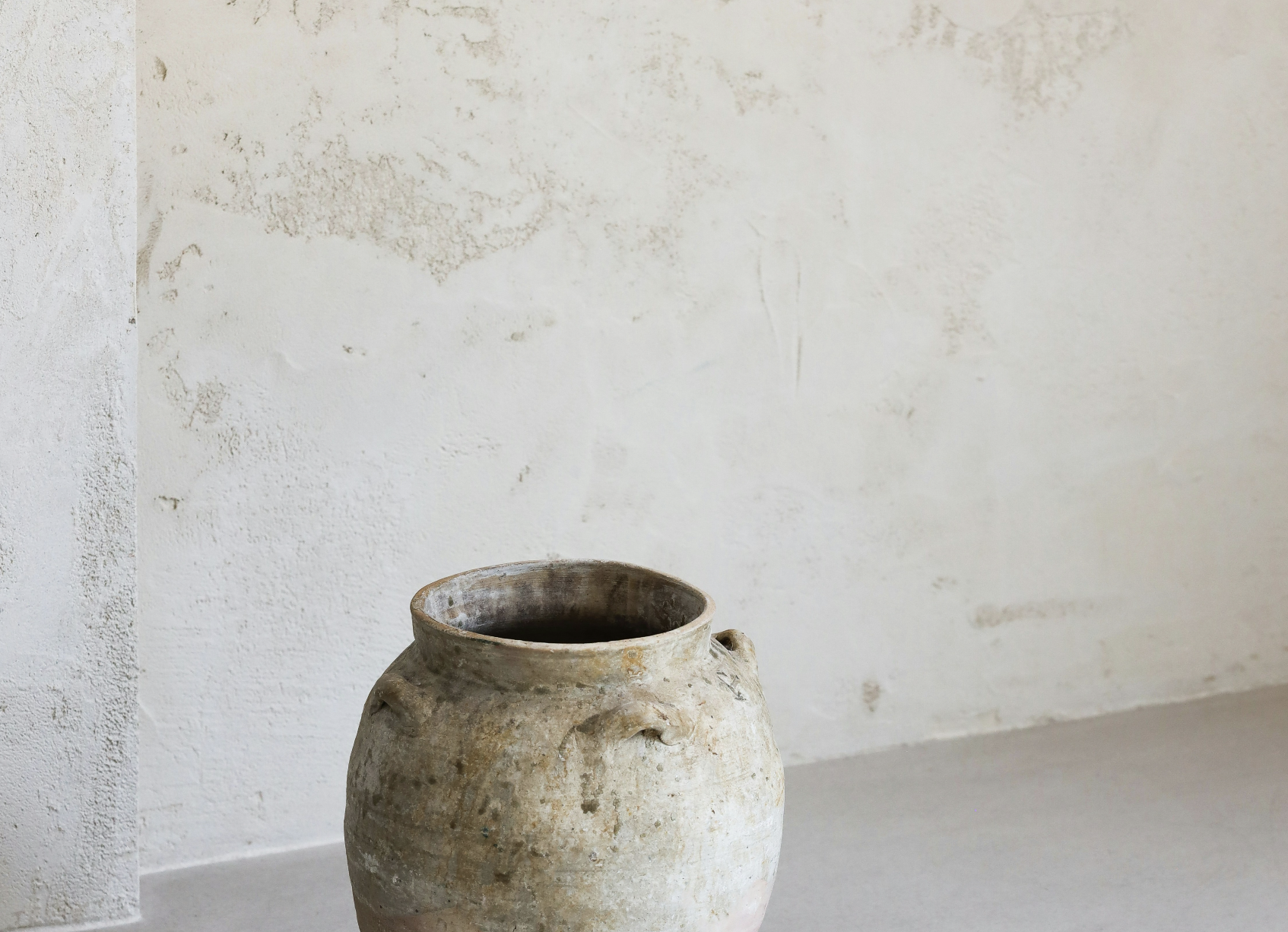
The quiet luxury of slow
Framed by Waves, Grounded in Calm — The Visual Soul of azulomo
Every brand begins with intention.
azulomo began with stillness.
Not as a marketing idea or a business concept, but as a personal turning point. After years of living fast—deadlines, pressure, constant movement—we hit pause. Life didn’t ask. It insisted. What followed was a conscious decision to shift gears, slow down, and start again—this time, more gently. That decision didn’t just shape our lifestyle. It became our brand.
The azulomo logo is more than a design. It’s a visual expression of what we chose to live by: presence, calm, and meaningful simplicity. It doesn’t aim to shout or compete. It sets the tone. It’s a mark rooted in clarity—a reminder of what happens when you stop rushing and start being.
We built azulomo around that shift. From fast to slow. From doing to feeling. From chasing more to choosing well.
And the logo—or shall we say, the brand? Well, here’s the story.

The azulomo logo is more than a mark—it’s a meditation. A visual breath. A soft, steady signal of what we stand for: calm, elegance, and the quiet luxury of slow living.
A Name that Knows How to Linger
Before it was a brand, azulomo was a feeling. A word that emerged like a wave—simple, fluid, and grounded in rhythm. The name blends azul, the Portuguese word for blue—evoking sea, sky, and open space—with lomo, a gentle nod to softness, calm elevation, and slowness. Together, azulomo rolls off the tongue like a lullaby, its final o slightly slanted in the logo—a subtle invitation to slow the syllables and savour the moment.
This isn’t branding that tries to impress. It’s branding that remembers how to feel.
The Lines: Symbols of Sea and Stillness
Framing the word azulomo are nine hand-drawn lines—wave-like, flowing, yet purposeful. They’re not there to decorate. They’re there to hold.
The top lines represents vision, clarity, and breath—the expansive stillness of sky and thought. The lower lines grounds us, like sand beneath your feet or the horizon that holds everything in balance. Together, they speak of flow and containment. Of softness and structure. Of the kind of life that doesn’t need to shout, because it resonates deeply.
These lines are waves—but also boundaries. Movement—but also anchoring. They embody the azulomo ethos: purposeful, poetic, and profoundly human.
The Typeface: Elegant, Timeless, Subtle
Our logo typeface is refined without being rigid. Its simplicity is intentional, allowing space for the feeling to settle in. The slight tilt of the final o isn’t a quirk—it’s a cue. A pause. A breath. A final note of warmth that slows the eye and softens the pace.
This type isn’t trend-led—it’s time-honoured. It lives in the in-between: between modern and timeless, between polished and poetic. It’s the kind of elegance that doesn't date.
The Colours: Grounded in Nature, Elevated by Intention
At the heart of the azulomo palette lies our primary hue:
Golden Sand (#A79D8B) – A warm, grounding neutral inspired by sunlit dunes and the earthy beauty of southern European landscapes. It holds that softly aged tone you find in weathered limestone, windswept beaches, and time-worn plaster façades. It’s both elevated and understated—reminiscent of barefoot luxury.
Limestone (#E2E0D7) – Our secondary tone is calm, pale, and architectural. It carries that soft, Mediterranean warmth—the kind found in washed walls, coastal stone, and hand-trowelled textures. It doesn’t shout. It glows.
Olive Smoke (#686257) – A darker accent with depth and a hint of shadow. Grounded and serious without being severe, it balances the palette with soul and structure. Think driftwood, old olive trunks, and ceramic glaze.
Midnight Blue (#043139) – Our deepest tone, evoking night skies over the sea and the mystery of depth. It’s used sparingly, like punctuation—bold, but never brash.
White (linen kind of white) (#FAFAF9) – Soft white, not clinical. A canvas that feels sun-kissed rather than sterile. It’s light made visible.
Together, these tones form more than a palette. They’re an atmosphere. A visual expression of presence, poise, and thoughtful calm. They speak to a world that’s unhurried and deeply considered—just like our brand.
Our Logo Lives Where Stories Begin
You’ll find our logo where the journey begins—on soft overlays, sunlit corners, and thoughtful design moments. On linen-textured cards, calm websites, and moments that ask to be remembered. It’s not loud. It’s not white on white unless the background invites it. It’s contrast-aware, emotion-aware, and story-aware.
Because azulomo isn’t about taking up space. It’s about creating it.
One Mark. One Mood. Many Moments.
The azulomo logo is more than a signature—it’s our direction.
It doesn’t lead with noise, but with intention.
It’s a reminder to pause, feel, and create with meaning—
to design with clarity, host with care, and live with purpose.
This is the quiet luxury of slow.
This is azulomo.
→ If you’d like to delve into our story — from fast-paced beginnings to the quiet rhythm of slow — you can read it here.
→ If you’re curious to see how design meets meaning, gently held in every curve and line ~ Brand Guideline.
azulomo is a lifestyle brand rooted in the art of slow.
We help holiday home owners, boutique stay hosts, and thoughtful creatives design calm, soulful spaces that put feeling first. Our work blends strategy and storytelling with aesthetic intention—creating homes, brands, and guest experiences that feel as good as they look. With a focus on wellbeing, design clarity, and purposeful living, azulomo exists for those who believe luxury isn’t about more—it’s about meaning.
We’re not here to follow trends. We’re here to create depth.
This is the quiet luxury of slow.

“The azulomo logo is a refined wordmark wrapped in soft wave lines—simple, calm, and intentional. Its slightly slanted final o slows the rhythm, echoing our belief in pace and presence. Designed to feel as elegant as it is grounded, it reflects our core values: thoughtful design, emotional depth, and the quiet luxury of slow.”